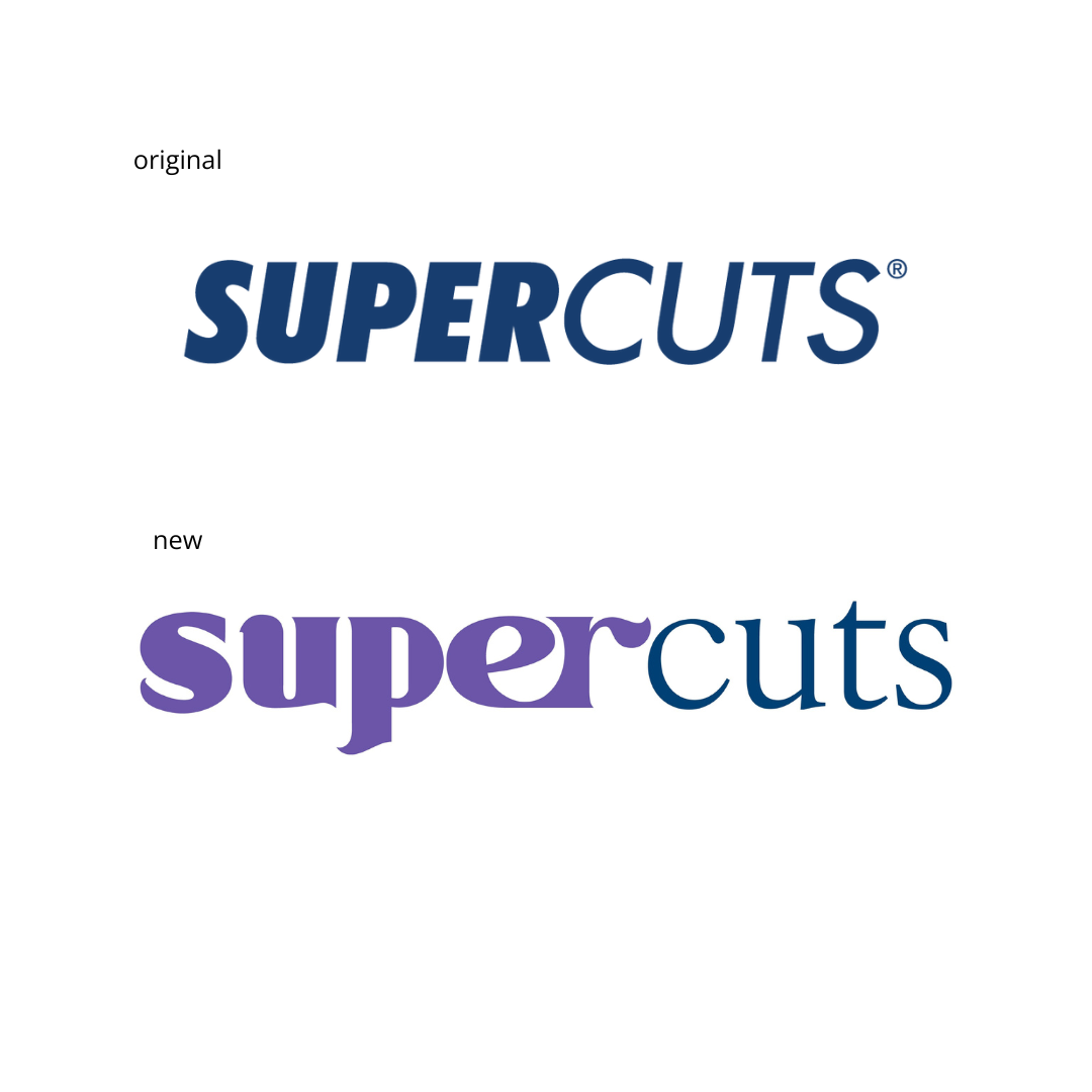
OVERVIEW
This Supercuts rebrand aimed to position the company as friendly and inclusive of all hair types, while also reaffirming its commitment to affordability and dependability. Overriding the dull, overly masculine typeface, the addition of playful Celestic opened up new avenues for continued growth and success as a nationally recognized brand.
APPROACH
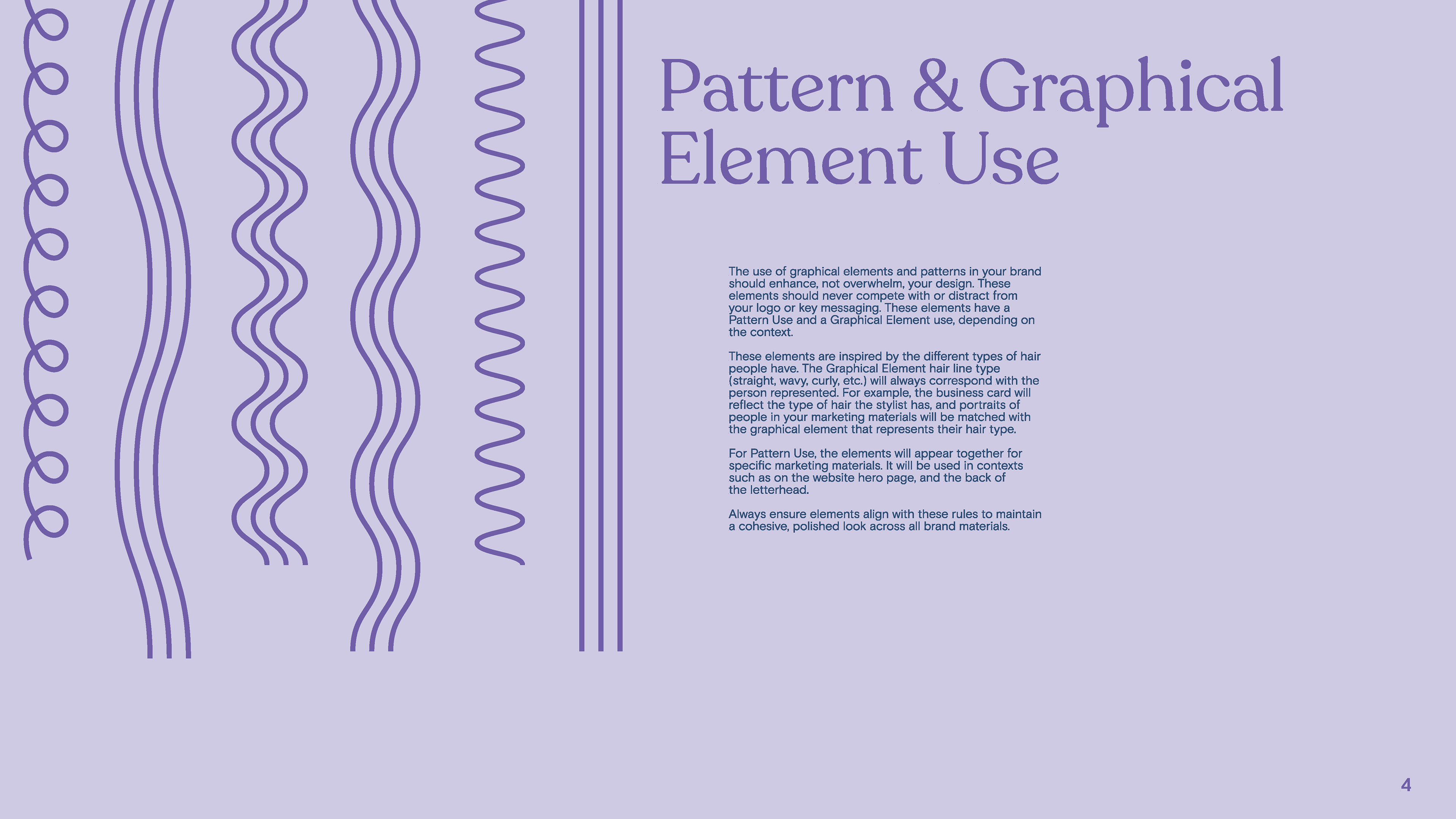
For Supercuts' logo rebrand, I focused on making the typeface and color palette more approachable and inclusive. The updated logo features a friendly, yet reliable presence, maintaining a sense of approachability and and professionalism. This rebrand takes on a new exciting life by modernizing the color scheme and adding a unique pattern and graphic element system.